My research has covered use of colour in moving image since the beginning of colour in moving image, looking at how colour progressed from hand painted techniques, to technicolor and through to the current digital era. I also explored academics opinions on current colour methodologies and observed the world around me. Through my critical analysis I’m hoping to tie my research together and to assess my own working methodology in obtaining it.
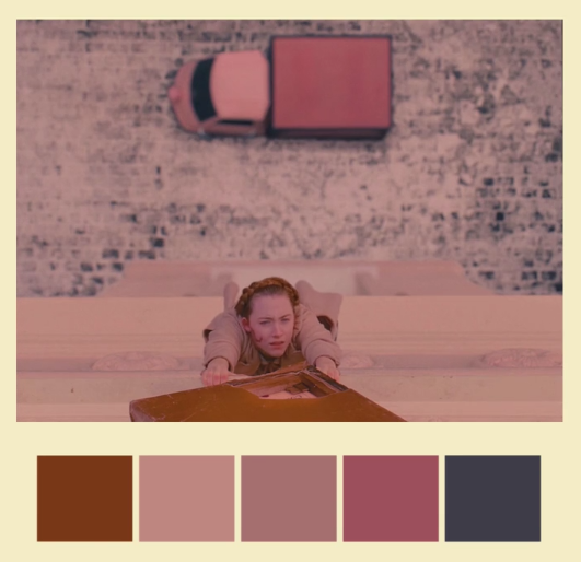
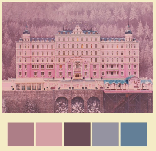
Through looking filmmakers work it appears obvious to me that although there are thought out colour structures that many artists start with, the most fantastical uses of colour in moving image are when those methodologies are reinterpreted. Knowing the general cognitive effects of colour to your audience is important in allowing you to make the correct colour choices, particularly regarding the value and saturation of the colour used. As we have seen in the works of those who dared to step out of the ordinary schemes, particularly regard the work of Wes Anderson in ‘The Grand Budapest Hotel’ or of the film ‘Hero’, these are where new unconventional theories regarding colour are innovating from, and it is because of those films that I believe that an individual artist or filmmaker who is considering why they are doing what they are doing can essentially make up their own rules. They can tell the story however they choose and if that means blood red represents happiness then so be it.
I begun this process thinking colour connections and meanings don’t carry much weight globally, I have since changed my mind, colour can have meaning but what I’ve learned is that there is a method of using colour that will enlighten your work and that essentially it is often preferable to make up your own meaning. I would argue that that is the modern colour theory.
Older colour theories are dictated by the technologies of the time, and because of our psychology we regard the use of those formulas as pleasing to the eye. In lower budget digital film colour has been somewhat put to one side, however the moving images we reflected on were focusing on colour and were strongly considering how an audience will react. A lot of time was spent considering this and formulating their own artistic ideas and thence testing the boundaries of what hasn’t gone before them; innovation.
Recent studies have concluded that a 21st Century audience has poor color memory with regard digital moving image. (Block, 2008). Through using whimsical or unexpected amounts of colours artists like Anderson, Jonze and many others create an immediate association with their work.
Another reflection I’d like to make is how colour is noted very often in musical terms, Maurice Nobel and Natalie Kalmus talked about creating colour harmonies and colour scores respectively, Wallace Riminigton’s ColourMusic expressed that,
“Color, like music, is both precious for its own sake and as an educative influence. It can also stimulate the imagination and develop other mental faculties; can give pleasure and refreshment to the mind, and increase the responsiveness of the sense to which it appeals” (Riminigton 1912).
My reasoning for highlighting this is because although those are all artist’s of the 20th century my own colour education was not different at all. At third-level the little that was spoken about colour on my animation degree from Bournemouth University was from one-on-one discussions with tutors discussing with me how colour should be used in animation, and my tutors view was to think of it terms of musical harmonies, which is what led me to creating colour inventories for my work, in light of this research I now question whether musical-like colour balancing is outdated. As O’Connor pointed out, these potentially outdated views, need to be reviewed and re-explored for a modern digital era. From doing this research I wholly believe colour, even the differences, contradictions and confusions between artists methodologies is vastly important and is to be explored and researched at university level.
Looking at my own methodology, the beginning of this project confused me a lot, I found that some my my bibliography entries were becoming reflections on the texts I was reading, I think that as I progressed with that process I begun to understand more so what was expected of me. My research technique was to begin by reading the texts I thought relevant to my subject matter and to listen to how these authors were displaying colour and particularly colour in moving image. I travel a lot so these texts became my travel companion.Microsoft’s ‘sticky notes’ became an invaluable tool and assisted me in finding all the quotes I wanted to mention when the time came to actually writing the blog entry, I observed early detail of interest to me so with editing a lot of these notes got curtailed. My texts hailed from 20th and 21st centuries and so I was constantly considering, is this still relevant with today’s technology, I was pleased when I found that Zena O’Connor was asking the same questions.
During this period of reading and research I begun to watch all the films I could that were recognised for their colour uses, before beginning to critically reflect on those, making reference to the content and issues that I explored in my bibliography readings. I found it somewhat challenging to work in this way and I believe that a lot of that is to do with the part-time nature of the course, my mind is often on other things, so switching back to my masters work could be sometimes frustratingly difficult. I found myself making notes and draft blog posts when I could and then finishing them off at a later date. If I had the luxury of devoting myself to research full time I would be much more focused in my results.
Do I feel that I achieved and learned something in my research? Yes very much so, I know now to consider more deeply the hows and whys of colour. When watching the pictures I studied I found I began to consider colour choices in the film as I was watching, colour was certainly my priority and I was constantly pondering why certain choices were made and if modern digital artists even considered those choices before shooting their film, or was it all part of post production.
Polson, T., Noble, M. and Jones, C. (2013) The noble approach: Maurice Noble and the Zen of animation design. Thousand Oaks, CA, United States: Chronicle Books.
Block, B. (2008). The visual story: Creating the visual structure of fi lm, TV and digital media. New York, NY: Focal Press.
Higgins, S. (2007) Harnessing the technicolor rainbow: Color design in the 1930s. Austin, TX: University of Texas Press.
O’Connor, Z. (2010). Black-listed: Why colour theory has a bad name in 21st century design education. Available at: http://connected2010.eproceedings.com.au/papers/p4.pdf (Accessed: 30 October 2016).
Rimington, A.W. (1912) Colour-music.


 fig.03
 fig.01
 fig.02
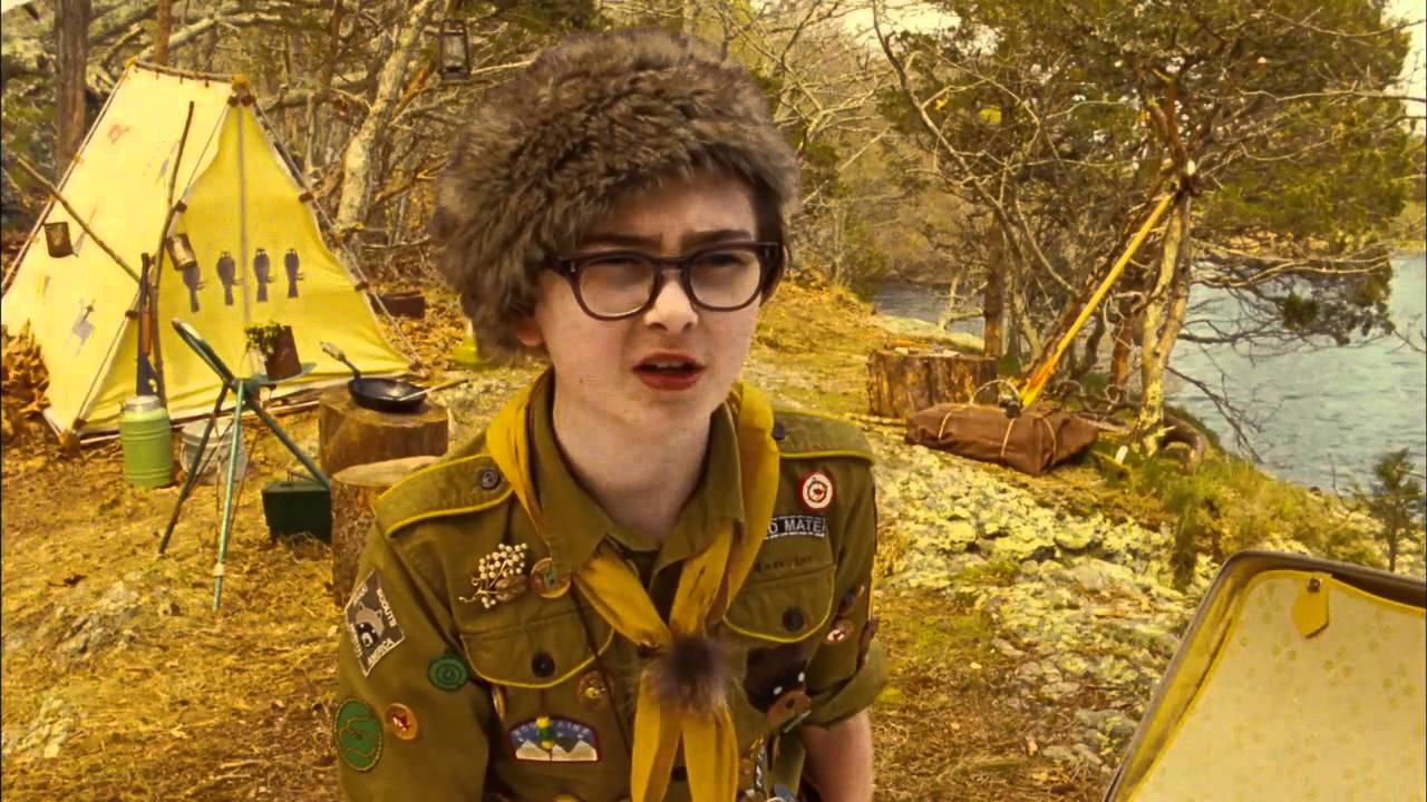 fig.03
 fig. 04
 fig.01
 fig.02
 fig.03
 fig.01
